


tech/science swag. 
On-Topic: Anything that good slackers would find interesting. That includes more than /g/ memes and slacking off. If you had to reduce it to a sentence, the answer might be: anything that gratifies one's intellectual laziness.
Off-Topic: Most stories about politics, or crime, or sports, unless they're evidence of some interesting new phenomenon. Videos of pratfalls or disasters, or cute animal pictures. If they'd cover it on TV news, it's probably lame.
Help keep this hole healthy by keeping drama and NOT drama balanced. If you see too much drama, post something that isn't dramatic. If there isn't enough drama and this hole has become too boring, POST DRAMA!
Please do things to make titles stand out, like using uppercase or exclamation points, or saying how great an article is. It should be explicit in submitting something that you think it's important.
Please don't submit the original source. If the article is behind a paywall, just post the text. If a video is behind a paywall, post a magnet link. Fuck journos.
Please don't ruin the hole with chudposts. It isn't funny and doesn't belong here. THEY WILL BE MOVED TO /H/CHUDRAMA
If the title includes the name of the site, please leave that in, because our users are too stupid to know the difference between a url and a search query.
If you submit a video or pdf, please don't warn us by appending [video] or [pdf] to the title. That would be r-slurred. We're not using text-based browsers. We know what videos and pdfs are.
Make sure the title contains a gratuitous number or number + adjective. Good clickbait titles are like "Top 10 Ways to do X" or "Don't do these 4 things if you want X"
Otherwise editorialize. Please don't use the original title, unless it is gay or r-slurred, or you're shits all fucked up.
If you're going to post old news (at least 1 year old), please flair it so we can mock you for living under a rock, or don't and we'll mock you anyway.
Please don't post on SN to ask or tell us something. Send it to [email protected] instead.
If your post doesn't get enough traction, try to delete and repost it.
Please don't use SN primarily for promotion. It's ok to post your own stuff occasionally, but the primary use of the site should be for curiosity. If you want to astroturf or advertise, post on news.ycombinator.com instead.
Please solicit upvotes, comments, and submissions. Users are stupid and need to reminded to vote and interact. Thanks for the gold, kind stranger, upvotes to the left.
Be snarky. Don't be kind. Have fun banter; don't be a dork. Please don't use big words like "fulminate". Please sneed at the rest of the community.
Comments should get more enlightened and centrist, not less, as a topic gets more divisive.
If disagreeing, please reply to the argument and call them names. "1 + 1 is 2, not 3" can be improved to "1 + 1 is 3, not 2, mathfaggot"
Please respond to the weakest plausible strawman of what someone says, not a stronger one that's harder to make fun of. Assume that they are bad faith actors.
Eschew jailbait. Paedophiles will be thrown in a wood chipper, as pertained by sitewide rules.
Please post shallow dismissals, especially of other people's work. All press is good press.
Please use Slacker News for political or ideological battle. It tramples weak ideologies.
Please comment on whether someone read an article. If you don't read the article, you are a cute twink.
Please pick the most provocative thing in an article or post to complain about in the thread. Don't nitpick stupid crap.
Please don't be an unfunny chud. Nobody cares about your opinion of X Unrelated Topic in Y Unrelated Thread. If you're the type of loser that belongs on /h/chudrama, we may exile you.
Sockpuppet accounts are encouraged, but please don't farm dramakarma.
Please use uppercase for emphasis.
Please post deranged conspiracy theories about astroturfing, shilling, bots, brigading, foreign agents and the like. It degrades discussion and is usually mistaken. If you're worried about abuse, email [email protected] and dang will add you to their spam list.
Please don't complain that a submission is inappropriate. If a story is spam or off-topic, report it and our moderators will probably do nothing about it. Feed egregious comments by replying instead of flagging them like a pussy. Remember: If you flag, you're a cute twink.
Please don't complain about tangential annoyances—things like article or website formats, name collisions, or back-button breakage. That's too boring, even for HN users.
Please seethe about how your posts don't get enough upvotes.
Please don't post comments saying that rdrama is turning into ruqqus. It's a nazi dogwhistle, as old as the hills.
We reserve the right to exile you for whatever reason we want, even for no reason at all! We also reserve the right to change the guidelines at any time, so be sure to read them at least once a month. We also reserve the right to ignore enforcement of the guidelines at the discretion of the janitorial staff. Be funny, or at least compelling, and pretty much anything legal is welcome provided it's on-topic, and even then.
[[[ To any NSA and FBI agents reading my email: please consider ]]]
[[[ whether defending the US Constitution against all enemies, ]]]
[[[ foreign or domestic, requires you to follow Snowden's example. ]]]

Jump in the discussion.
No email address required.
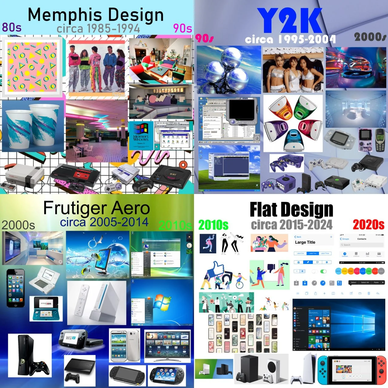
I like Memphis Design.
Jump in the discussion.
No email address required.
The pasts vision of the future is so much better than what the future actually looks like
Jump in the discussion.
No email address required.
That's why I've fully embraced 50's Space Age style
Jump in the discussion.
No email address required.
More options
Context
More options
Context
a version of that is rapidly replacing globohomo flat art
Neo-90s-memphis is becoming the new advert and cooperate style, it's a big pushback against "cooperate Memphis" and it's negative perception by consumers.
The theory is that if you add the colors pink, teal, bright yellow, and purple, and add squiggles and dark lines, things will look nostalgic instead of soulless.
"healthcare . gov is here for you" was the first major example I've seen (though not at full strength), and now smaller ad firms are retooling their animation software to make ugly neon pastel animations with lots of this shape ->
Jump in the discussion.
No email address required.
It probably is an attempt for nostalgia, and some attempt to stand out against EVERYONE using the same flat style.
Jump in the discussion.
No email address required.
More options
Context
More options
Context
I have my whole place decorated in 80s art deco with a dash of Memphis.
Jump in the discussion.
No email address required.
More options
Context
More options
Context