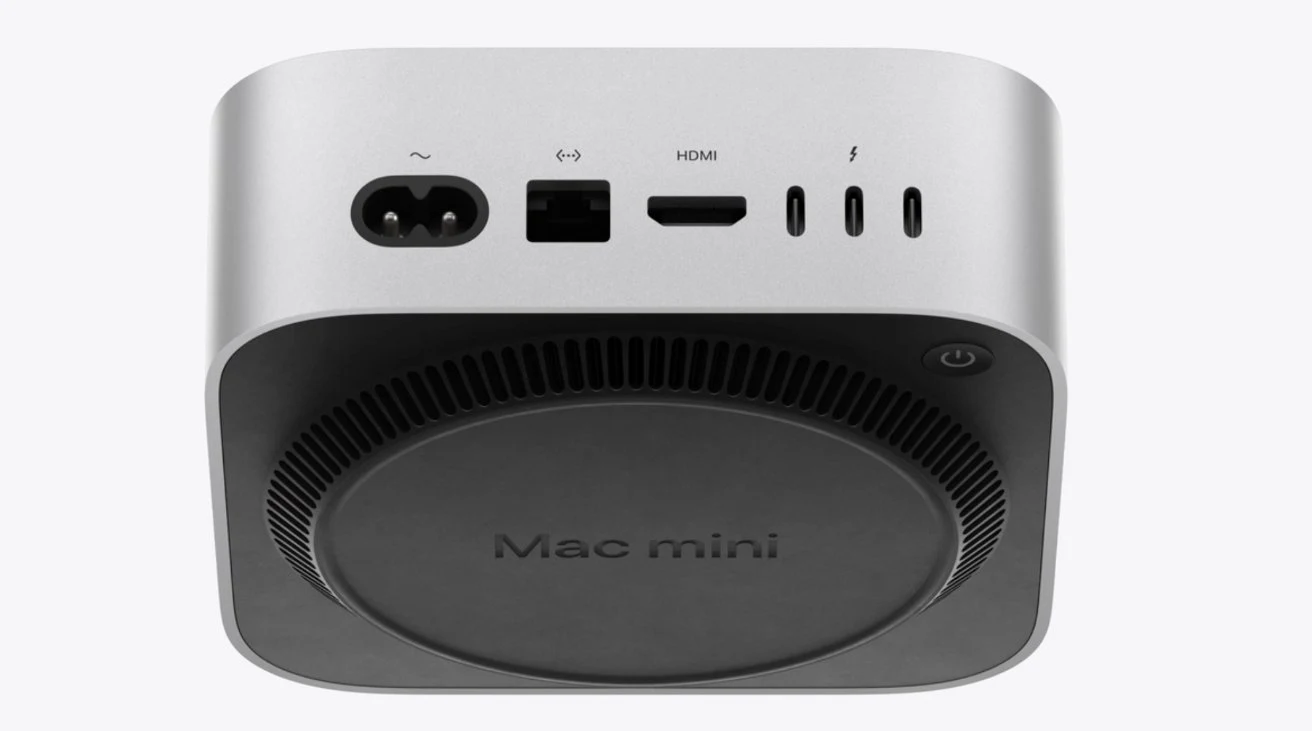
Don't expect to fit the new M4 Mac mini into too tight a space because you're going to have to tip it to reach underneath every time you need to switch it on.
If the position of the charging port on the Magic Mouse isn't the questionable design choice it's been called, the New Mac mini power button might be. As pointedly not shown by Apple in its launch video or new ad — the Mac mini power button is underneath the device.
As can be seen on the online store's page for the new M4 Mac mini, the button is not on the very base of the model. It is, though, underneath it, raised off the ground only by the cooling vent.
Another banger design choice from Steve Tim Apple 


Jump in the discussion.
No email address required.
Just flip it upside down?? The vent will even cool easier that way. Why are apple users so stupid lmao
We need trans hedgehogs! Trans hedgehogs belong here! We love trans hedgehogs!
Jump in the discussion.
No email address required.
Then the heat will fall to the bottom, stupid
Jump in the discussion.
No email address required.
HEAT RISES
YOU TROGLODYTE
We need trans hedgehogs! Trans hedgehogs belong here! We love trans hedgehogs!
Jump in the discussion.
No email address required.
NOT IF THE COMPUTER IS UPSIDE DOWN
Jump in the discussion.
No email address required.
IF YOU FLIP OVER THE POWER BRICK THE FAN AND BUTTON WILL BE ON TOP!
this is just the dock/hub and not the whole computer, right?
We need trans hedgehogs! Trans hedgehogs belong here! We love trans hedgehogs!
Jump in the discussion.
No email address required.
More accurately, this is just an external PCMCIA bus
Jump in the discussion.
No email address required.
Yeah it should be easy to flip right?
We need trans hedgehogs! Trans hedgehogs belong here! We love trans hedgehogs!
Jump in the discussion.
No email address required.
More options
Context
More options
Context
More options
Context
More options
Context
Not when you turn in upside down cute twink
Jump in the discussion.
No email address required.
More options
Context
More options
Context
More options
Context
More options
Context