The Census results are in and badges have been distributed!

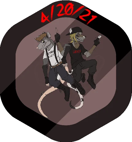
Unfortunately I realized after the first two that I'd been writing "21" instead of "22" for the year and I was too lazy to fix them, so these are rare, limited edition (TEMPORAL FLUX EDITION) badges. This is reflected in the tooltip when you hover over (or for mobile chads, tap on) the badge and look at its name. Wow!
Those of you who voted correctly and selected Columbine 
 Day have received the coolest badge, the Columbine Enthusiast (TEMPORAL FLUX EDITION) Badge
This day was a terrible tragedy and set off the epidemic of school shootings still persisting in the West to this day. Many lives were taken, more were ruined that day. Shame on everyone who voted otherwise. You get inferior badges.
The Hitler  Day segment of the voting populace received the 21st Century Hitlerite (TEMPORAL FLUX EDITION) Badge. It is lackluster, because they should be ashamed of themselves, and it is cast in silver, because they will never be winners.
The Weed  Day demographic received this hideous Duterte's Most Wanted (TEMPORAL FLUX EDITION) Badge. It looks like butt because I had people trying to trick me into what color is actually green and I got flustered and also weed is gay and so are you. Stop doing drugs, losers.
And, finally, those of you who voted "Wednesday  day" do not get a badge. Of course it's Wednesday. What a boring fricking answer, why would you get rewarded for that? Instead, you've received the (minor) payout from the Census, a paltry like 474 dramacoin. Use it to live a little and maybe get some imagination. God you're dull. Bet you have leftovers on New Years Eve and go to bed at 10:30. Nerds.






.webp?h=10)

Jump in the discussion.
No email address required.
BEFORE that
and i still dont believe thats the right green
Jump in the discussion.
No email address required.
Why don't you just use the eyedropper tool? I think weed green is usually a little earthier but it looks fine as is
Jump in the discussion.
No email address required.
cuz maybe the source image is the wrong shade and only good from the lighting
or its a stylized image of a pot leaf
or its just a bad image and the color is wrong
it is UNRELIABLE
Jump in the discussion.
No email address required.
I guess that makes sense, what an emotional evening this has been for you
Jump in the discussion.
No email address required.
I should probably do a real carpcrying
Jump in the discussion.
No email address required.
He should probably have his eyes closed and be facing the direction he's pointing to then lol, but I like it your way better. I thought he was flailing his fins but one of them is limp
Jump in the discussion.
No email address required.
I thought Id change it as little possible cause fish dont really show emotions but that backfired
Jump in the discussion.
No email address required.
It did not backfire, its one of my favourite marseys
Jump in the discussion.
No email address required.
Jump in the discussion.
No email address required.
More options
Context
More options
Context
More options
Context
More options
Context
More options
Context
Jump in the discussion.
No email address required.
More options
Context
More options
Context
More options
Context
More options
Context
if theres one thing I always take seriously its graphic design.
Jump in the discussion.
No email address required.
More options
Context
there shoulda been another green badge..spring green 😔
Jump in the discussion.
No email address required.
More options
Context
More options
Context