
/h/meta
 DragginBallz
I/I
I don't really like talking about my flair
19hr ago
(image post)
Edited 12hr ago
107 thread views
#341769
earned 88 coins from votes
DragginBallz
I/I
I don't really like talking about my flair
19hr ago
(image post)
Edited 12hr ago
107 thread views
#341769
earned 88 coins from votes
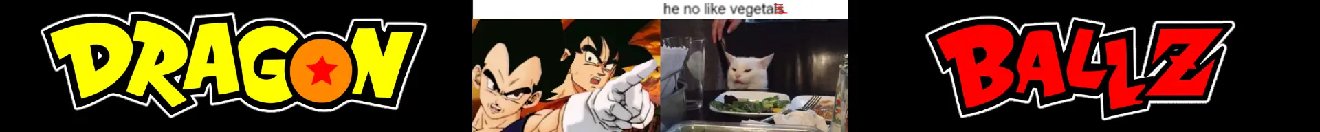
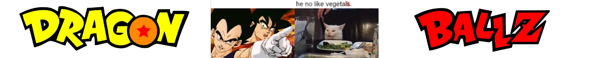
Which background color works better for this banner?

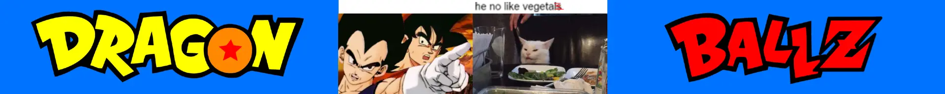
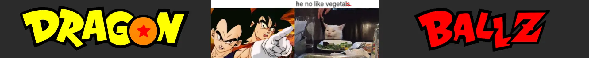
- 11
- 21


Jump in the discussion.
No email address required.
Blue clashes with the yellow/orange text. Muted colors like gray are ultra cliché at this point.
The stark black on the other hand contrasts nicely with the text, especially the red font, and saturated colors are based and CHAD coded
Jump in the discussion.
No email address required.
Good points but also don't forget the original artwork for historicity
Jump in the discussion.
No email address required.
More options
Context
More options
Context