

/h/meta
 DragginBallz
I/I
I don't really like talking about my flair
19hr ago
(image post)
Edited 11hr ago
107 thread views
#341769
earned 88 coins from votes
DragginBallz
I/I
I don't really like talking about my flair
19hr ago
(image post)
Edited 11hr ago
107 thread views
#341769
earned 88 coins from votes
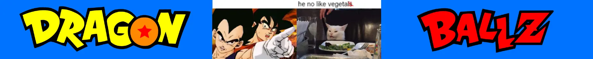
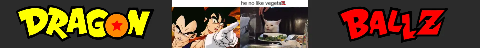
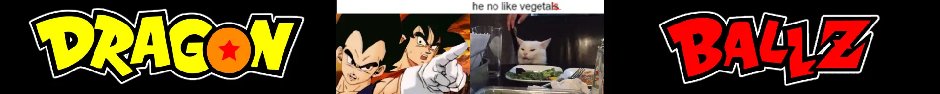
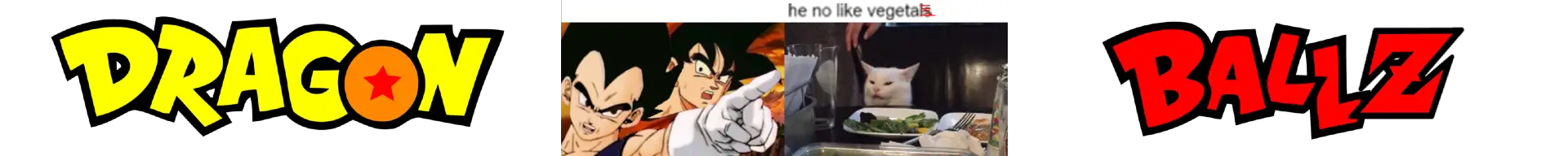
Which background color works better for this banner?


- 11
- 21


Jump in the discussion.
No email address required.
Black looks the best, blue is obviously historically accurate, but it looks really jarring with the central picture. Idk, maybe some border on the sides could fix that, but I'm not an expert.
Jump in the discussion.
No email address required.
Honestly I prefer violating the 1920x192 banner rule and not have any of it. The side stuff and background is just filler to get it those dimensions.
Blue was the first one I tried and I fully agree the center image is too jarring so I tried other colors to tone it down.
IMO just make the entire background black with no DBZ text, or a radial gradient from black to blue on the sides. Boring but it focuses you to the image.
Know what, I'll just do that and submit it.
Jump in the discussion.
No email address required.
More options
Context
More options
Context